A strong logo is essential for your brand. It's often the first thing customers see. But what makes a truly good logo? This blog post explains what a logo should be like and why it's smart to think carefully about its design.
1. The most important features of a strong logo
A good logo has a few important features:

Simplicity
A logo should be simple and clear. This makes it easy to recognize and remember. Think of the Apple or Nike logo. Less is often more.
Recognition
Your logo should stand out from other brands. It should be unique, so people recognize it immediately.
Scalability
Whether you place the logo small on a pen or large on a billboard, it always has to look good. Therefore, use vector graphics that can be scaled up or down without loss of quality.
Timelessness
A good logo stays relevant for years. Avoid trendy designs that quickly become outdated. Choose a style that will last.
Versatility
The logo should work in different colors and on different backgrounds. It should look good everywhere, whether it's on a website, a T-shirt, or in black and white.
2. Graphic design: the key to a good logo
Graphic design is more than just creating a pretty picture. It's about creating a logo that perfectly reflects your brand.

Colour
Colors have a significant impact on how people perceive your brand. Blue represents trust, red energy. Choose colors that align with your brand.
Font
Your logo's font says a lot about your brand. A clean font looks modern, while a classic font exudes tradition. Choose a font that sets the right tone.
Shape and Symbol
The shapes and symbols in your logo should reinforce your brand. Round shapes are friendly, while straight lines exude strength.
3. Why AI isn't ready for logo creation yet
AI tools can create logos quickly, but they are not yet good enough to design a unique and powerful logo.
No creativity
AI follows fixed rules and patterns. It can't think outside the box like a human can. This can make an AI logo less original.
Not unique enough
Many AI logos look similar. This is because they're based on the same algorithms. This makes it difficult to create a logo that truly stands out.
Less emotion
A logo should evoke emotions in people. A human can translate the right emotions into a design. AI can't do that yet.
Difficult to adjust
AI tools offer little flexibility. Adjusting details can be difficult. A human designer can better respond to your needs.
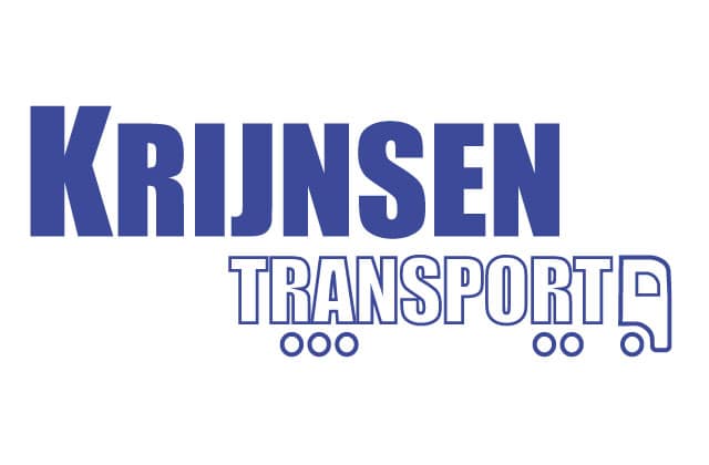
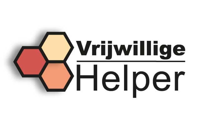
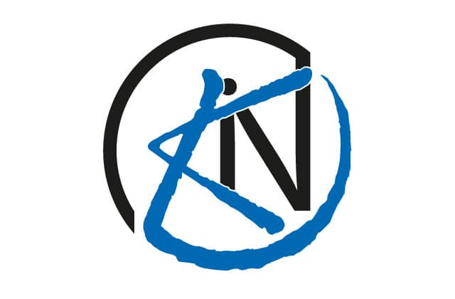
I had the logo shown here created using the AI tool included in the Adobe software package. I specified the same requirements as for the Environmental Cooperative logo.
As you can see, the logo does not meet the requirements of a good logo, but it could have served as inspiration for the logo.

Conclusion: choose quality
A good logo is worth investing in. AI can help, but it doesn't replace the creativity and expertise of a graphic designer. Want a logo that truly reflects your brand? Then take the time to get it right.

