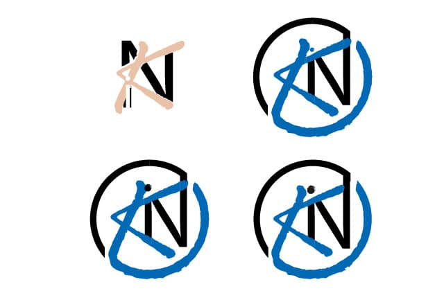
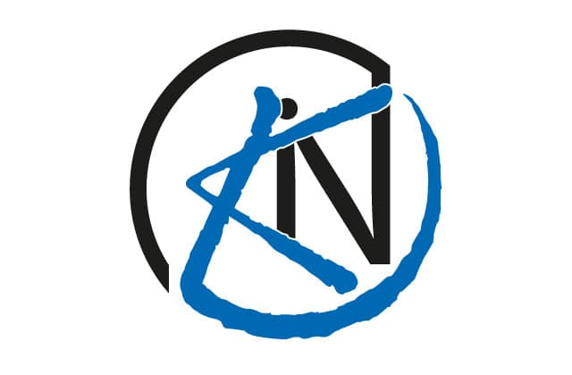
Kantoor Inkoop Nederland was looking for a favicon logo design based on their existing logo. They wanted to retain the essence of the logo, emphasizing the 'K' and the colors, while keeping the letters K, I, and N visible. They also wanted to give the logo a sleeker, more modern look.
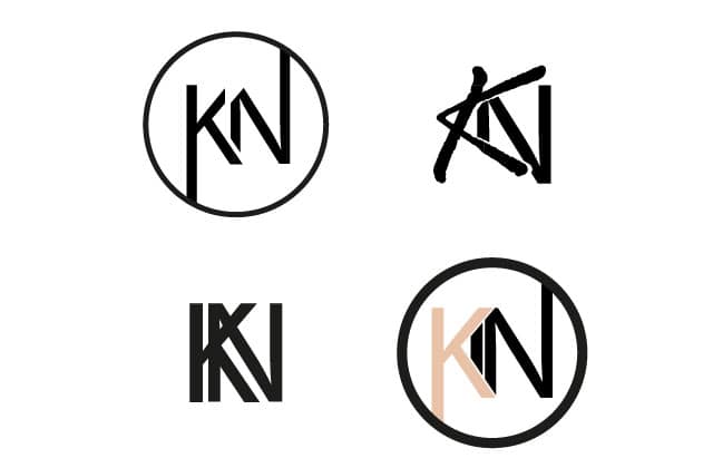
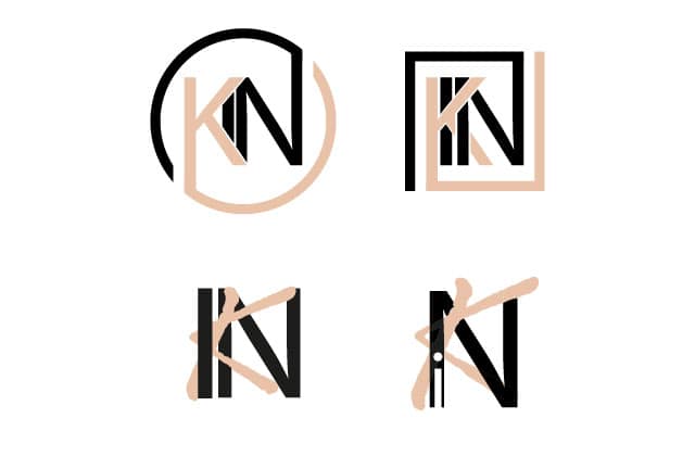
The 'K' in the existing logo was already easily recognizable and contributed to its character. This was the reason to retain it and bring that same recognizability and character to the new logo design. In the sketches below, you can also see that the logos with the more streamlined 'K' lack some character.
For the 'N', I chose to design it cleanly in the same font as the rest of the word 'kantoorinkoop' (office purchasing). This font was already modern and sleek, making it a perfect fit for the desire to give the new logo a contemporary look.


Get in touch! We can brainstorm together to see how we can solve your problems with graphic design.
